a cohesive visual identity that captures your brand’s DNA and makes it instantly recognizable.


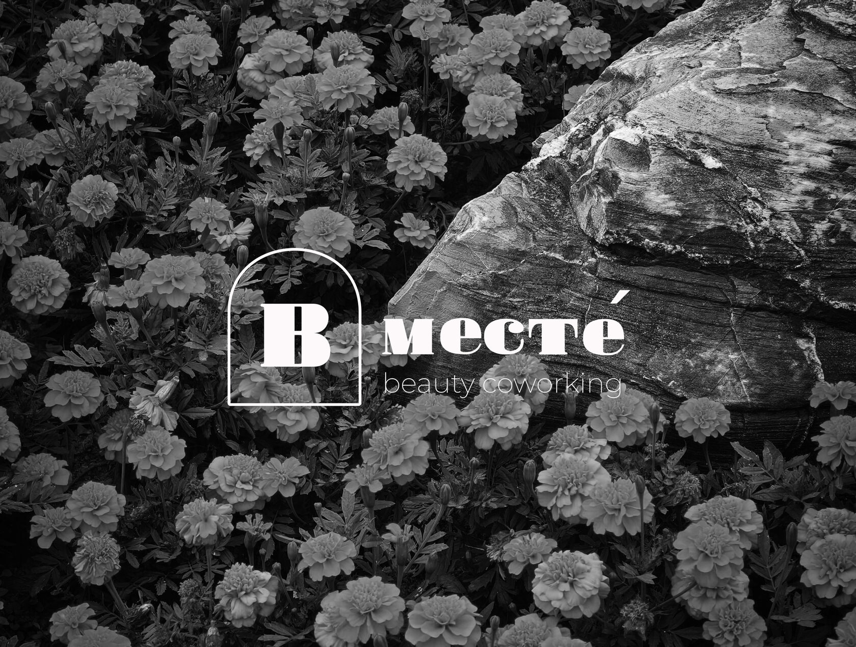
Vmeste — 2022
Vmeste is a coworking space created for beauty professionals. The goal was to develop a logo that communicates comfort, warmth, style, and a welcoming atmosphere while appealing to both beauty professionals and their clients.
A rounded, humanist wordmark with a soft warm palette. The system is built around generous spacing and a single accent tone, so the mark stays recognisable at any size — from an app icon to a full wall.
process
LOGO DESIGN — FROM $300-
Once the project is confirmed and a 50% deposit is received, the logo process begins. The first step is a brief covering the key aspects of the brand: how the idea came about, how it was created, what stands behind it, and how you want it to be perceived. We also discuss your preferences, audience and where the logo will be used — from websites and social media to packaging and print. This helps establish the context of the brand and define the direction for the logo.
-
After the brief, we analyse the market, competitors and the brand’s visual context. We explore current solutions within its category, gather relevant references and create a moodboard to define the visual direction for the logo.
-
Based on the research and defined direction, two distinct logo concepts are developed. Each concept has its own idea, visual character and approach to typography or symbol. After the presentation, the concepts are discussed and one direction is selected for further development. The chosen concept is then refined based on feedback. Two rounds of revisions are included.
-
Once the final design is approved, all necessary logo versions are prepared, including the primary and alternative versions, black-and-white version, and files for digital and print use. The final work is presented in a project presentation. Once the remaining balance is paid in full, the presentation and all final files are delivered in convenient formats for further use.


my approach
my approach
I’m not here just to execute a brief. I like to be involved in the process, bring ideas to the table, ask questions, and take initiative when I see a better direction for the project.
I value clear and honest collaboration. That’s why I work with a contract from the start — so expectations, timelines, and responsibilities are clear, leaving more space to focus on what really matters: creating great work together.

